Thursday, 1 April 2010

Evaluation.

1: In what ways does your media product use, develop or challenge forms and conventions of real media products?

Our media product uses and in a way, it also challenges the forms and conventions of it's genre. Upon analysing other psychological thrillers, I gained a good understanding of the conventions used within those texts. For instance, while we did think about creating a psychological drama... By combining the 'psychological' element with the 'thriller' element, it's quite successsful, in raising tension and suspense. Therefore we used that idea in planning our title sequence. Also, other thrillers use the theme of characters with a level of mental frustration. Physical danger is not the focus with psychological thrillers. We based our plot on that idea.

Many "psychological thrillers" place alot of emphasis on their titles. We also decided to place 'Carrie's Rose' (the title) at the end of the sequence, leaving the audience pondering. For example "The Butterfly Effect", a similar psychological thriller movie, also used this technique. Another idea we were inspired by from The Butterfly Effect was the philosophical/informative quote used at the beginning of the title sequence:
"It has been said that something as small as the flutter of a butterfly's wing can ultimately cause a typhoon halfway around the world.
-Chaos Theory"

(as seen below)

Just like our voiceover with the spoken quote, these features tend to add to the mood within the sequence, and gives the audience a greater idea of the storyline...

The Butterfly Effect clip:

[ click here to view on youtube.com ]


Unlike some thrillers, we chose to film in Charlton park, a deserted location at that time of day. This was because we wanted to oppose regular conventions... For example, the psychological thriller Hard Candy. The characters Jeff & Hayley first met in a public place (a very crowded cafe).
For our sequence, we wanted to portray a feeling of being gullible and vulnerable, which meant them both potentially being alone, but together. Carrie was so eager to see her internet lover, she was even willing to meet him alone in an empty park.
Just like all genres, and especially thrillers, props are used to convey meaning and mood/atmosphere. We used the rose as a symbolic item, as well as the costume of the character Carrie, which all forms her character image.
We used conventional shots such as over-the-shoulder to let the audience feel they're a part of the situation.
We borrowed the 'introductory scene' idea from Hard Candy, which is another psychological thriller in the same league as our product. This is when the characters meet for the first time, at the very start of the sequence...

2: How does your media product represent particular social groups?

In our title sequence, we represent 'teenage' girls and pedophiles.
However, within this cliché situation, we changed the classic stereotype of the naive girl, who's very gullable and easily led. Normally young girls are helpless when it comes to strangers/older men. Our male character is represented as mysterious, and we're completely unaware of his appearance, to enfore the idea that you never really know who you're talking to on the internet.
He's very manipulative and strategic in his 'grooming' of the girl. In this sense he's of a stereotypical social group. However, as he has no idea of her agenda, the roles are reversed as HE becomes the vulnerable, naive character. Neither representation is positive as the female character appears to have personal psychological issues. However, this allows her to be ruthless, devious and tactical, therefore this removes the 'power' from the pedophile.
Also, our product represents the rebellious, outcast type. Especially through the female protagonist, she's very much a loner, with her own 'individual' style.

Teenage girl:
-Likes to use online social networking tools.
-Likes all her music, an eclectic mix of sounds.
-Likes to have her own particular style, girly but rebellious. Tom-boy looking, but stylish.
-Likes the colors black and red.


Mysterious older male:
-Likes his hobbies, particularly Photography.
-Lives alone in the city, in a single apartment.
-Uses modern technology, PC's etc.
-Has an unknown style/image.


3: What kind of media institution might distribute your media product and why?

After searching online for different companies which distribute films, keeping in mind that some are independent, some are blockbuster, and could be either British or American or a combination... We decided on one which was generally quite popular and successful, and produces movies similar to our product.

[ New Line Cinema ]


Formed in 1967, New Line Cinema is a major American studio company. This is the type of Media institution we'd choose to distribute our product. Examples of films that were produced with this particular company are:

-The Butterfly Effect
-Final Destination
-The Long Kiss Goodnight
-Friday the 13th
-Se7en (as seen below)

All these movies have gripping storylines, and they're excellently edited pieces of cinema. This production company are responsible for some of the best films, of an eclectic mix of genres, ranging from rom-coms to horror to action, and most importantly, thrillers.
Our product falls into the pyschological thriller genre, therefore NLC would be an ideal company to represent it, based on the other films which they've produced.

Se7en:

A good example of a thriller produced by New Line Cinema. It has an interesting title sequence, and an intelligently thrilling plot.

Trailer:

[ click here to view on youtube.com ]


4: Who would be the audience for your media product?

The audience for our Media product would ideally be anyone over the age of fifteen years old, as the certificate rating will be '15'.
There's no particular gender preference, as both main characters personify male & female stereotypes - which are appealing to both sexes. The type of audience for this product would be people interested in psychology and drama. The group of people attracted to our product would probably be young adults as it wouldn't appeal to the elderly due to it's disturbing storyline. Also, some of the content within the film wouldn't be appropriate for young viewers under the age of 15 either. On the other hand, choosing JUST an '18' rating would potentially mean missing a good chunk of viewers from our target audience, so we chose to be as broad as we can.

A perfect target audience profile:
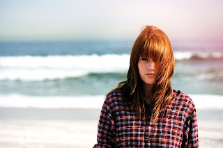

-University student. Female. 18 years old. Studies subjects such as Psychology or Sociology. A frequent internet user, she chats online regularly. Interested in dramas. Listens to a variety of musical genres, ranging from Classical to Alternative Rock to Heavy Metal. Enjoys movie classics, such as One Flew Over the Cuckoo's Nest, Psycho, The Exorcist... But also, more up-to-date titles such as Gothika, The Ring, Donnie Darko, Hard Candy, What Lies Beneath, The Butterfly Effect and Girl, Interrupted (as seen below)

Girl, Interrupted:

A film involving troubled young women, just like in our project. But this focuses mainly on the females within a mental institution. This is a prime example of a movie that focuses on mental illness, personality disorders, psychopaths, suicide and death, which is also aimed at teenage girls. It also has a certificate rating of '15'. It's quite dark and disturbing at times.

Clip:


5: How did you attract/address your audience?

We tried to create a dark and mysterious vibe, through the soundtrack. This was to reflect the thriller genre and it's forms and conventions. We found an Eerie/Ethereal type of feel, in a piece of music we found on the freeplaymusic.com website... (as seen below)
We feel it appeals to the target audience we were aiming for, based on their interest in thrillers and the psychological element.


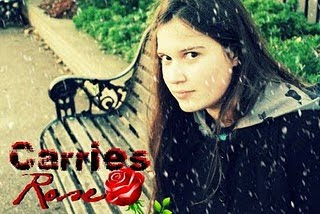
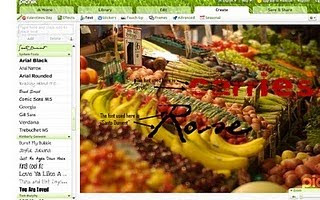
We used an online photo editing tool to create the title 'Carrie's Rose'... The process (as seen below) on the picnik website shows the experimentation of fonts etc. Mainly we stuck to the color scheme of black & red as it connotes the appropriate ideas regarding the storyline.

6: What have you learnt about technologies from the process of constructing this product?

First of all, here's a list of everything we used in the process of planning and constructing our sequence:
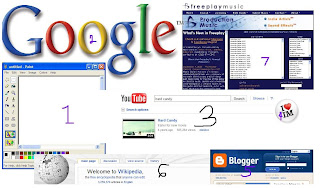

-Desktop PC (for all internet useage, editing, and other programs)
-Microsoft Paint (1) (for mood boards, etc)
-Adobe Premiere Elements (for editing the footage)
-Iloveim.com (4) (for creating the conversation scene)
-Google.com (2) (for all research purposes)
-YouTube.com (3) (for research of title sequences & filming styles/effects)
-Wikipedia.org (6) (for research movie genres/directors etc)
-Blogspot.com (5) (for blogging of the whole sequence and planning)
-Picnik.com (for creating the title/graphics)
-Freeplaymusic.com (7) (for finding the perfect background music)
-Camera/camcorder (for the actual filming, and for documenting different stages in the process, eg. the group using the software/blog)

Throughout the making of our title sequence, we used a number of different programs and features of technology. I feel this process has enabled me to make the most of research and planning time.
I've practised techniques to do with filming, and have also learned alot from the editing stage too, using the software. For example, I learned about fading, transitions, split scenes, black & white effect, etc etc.
Overall I think I've developed my skills in creating Media products, and this will prove very useful for future projects. The physical aspect, as in filming with the camcorder, has definitely helped, in the sense that I've grown confident about approaching this part of the development process.

7: Looking back at your preliminary task, what do you feel you have learnt in the progression from it to the full product?

While carrying out the preliminary task, I feel I've learnt alot about the techniques involved in filming different shots. For example, we practised the match on action shot, which is an important part of Continuity editing. We found this type of cut quite effective in bringing the scene together in a quick way, so the audience isn't aware of the noticeable cutting. As well as that we practised the shot-reverse-shot, which was all about perspectives. It creates the assumption for the audience that the two characters in the scene are facing each other.
The experience with the camera was very useful, as we didn't always get the shots right first time, so we learned the importance of creating the perfect shot.
Overall the tasks were helpful in gaining the basic skills needed to put together the smoothest sequence possible.
Practising the over-the-shoulder shot was quite beneficial, as we used this shot within our actual product, when showing the perspective of the protagonist during the online conversation scene and the park scene also.

I definitely learned some valuable lessons through the preliminary tasks, such as:
-How to keep a camera steady.
-How to get the best results using the zoom effect.
-How to put together cuts on the editing software.
-How to make the most of the time given to film.

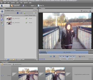
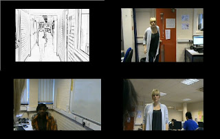
Below is a screen capture of the process of filming the different shots...
Tuesday, 23 February 2010

Final product!

The title sequence evaluation has to be finished, but here is the final product with the preliminary task shots:

{ click here to view on youtube.com }

Evaluation preparations...

We've started studying for the AS exams so we're going to get on with our evaluation in our spare time.
The voiceover has been recorded and finished and the sequence has been put together. Only a few adjustments need to be made to make it perfect.

Monday, 1 February 2010

This Monday...

We looked at textual analyses and studied different terms in preparation for our AS exam...
Also, our group have more or less finished filming, so... I put together what I think is a good idea for a voiceover in our sequence.

We borrowed it from Twilight, the movie. "And so the lion fell in love with the lamb. What a stupid lamb. What a sick, masochistic lion."

OUR VERSION:
"
I know he wants me. And I know why too. I'm the lamb, and he's the lion. Or at least he thinks I'm the lamb..."

-Reason being, we want to put focus on the switching of gender roles, and emphasise manipulation.

{this will be spoken in a soft, calm, sweet voice. It will come across quite disturbing}

[TITLE HAS BEEN CHANGED TO 'Carries' Rose']

Monday, 18 January 2010

The presentation print screens!

This is the final presentation...


The filming starts...

Some filming has been done in my absence. One of our college peers has agreed to be the actress for our sequence. The location has been changed to Charlton park as oppose to Greenwich park.
There were some problems regarding the videocameras but Dayo volunteered her digital camera so we have the resources to go out and film as long as our actress is in.
We still have the computer scene, the voiceover and more filming to do for the sequence.

Idea: Barbie & action man, both with short hair (to convey a sense of psychotic mutilation?)
The main character plays with the toy dolls, acting out herself and her internet friend...

We've been introduced to the idea of continuity editing...
In continuity editing everything is filmed so that the viewer thinks they are seeing continuous action. As well as following the rules below, you will need to ensure that characters’ appearance, the set and the lighting (colour and direction) remain consistent from shot to shot.
Here are pictures of us blogging and learning how to edit our videos;

- Me (Tiffany)

- Dayo


- Rosie

This is the software we're learning how to use;

- Adobe Premiere Elements

Monday, 23 November 2009

The presentation is over

We {Dayo, Rosie, Minh & me} showed Nina & Mark our presentation today. We were given alot of useful feedback and were told what else we have to include.

-We need to do the preliminary assignment, which is a few selected type of shots, each lasting 60 seconds?
-We need to make a shot-by-shot justification of everything we're doing in our frames {adjustments to the storyboard needed}
-We need to make a character profile from cut out images, to have a better representation of our films protagonist.
-We need to create a mood board from cut out images, just to build up an idea of the themes and imagery we want in our sequence.
-We need to do some research into the sound effects...

Tuesday, 17 November 2009

The day of the assignment

Yesterday we didn't get to do our presentation, the 2 groups that did theirs before us took so long that we had to leave as members of the group had another class to go to.
It was quite disappointing as we prepared all morning, but on the other hand, we now have time to do some last minute extra research to add in the presentation. We were told we'll be doing ours next Monday.

Wednesday, 11 November 2009

Blank day

Today we carried on planning our presentation, we're getting prepared for Monday.

Tuesday, 10 November 2009

Shots

Storyboard


In the presentation i'm going to talk about shots, and other ideas we've brainstormed so far.

- Extreme close up {of the protagonist's eyes}
- Point of view shot {of the computer/the conversation}
- Birds eye view {of the male character on the computer, maybe not his whole identity, maybe just the hands}

We're thinking of using a range of shots to create suspense and a sense of the characters enigmatic persona.

CREDITS;

New line cinema...

Directed by Dayo Adesina
Produced by Rosie Dwyer
Co- producer - Tiffany Vickery
Film Editor - Dayo Adesina
Production Design - Minh Dinh
Music composed by - Patrick James Slattery


Conflict of interest:
We decided against filming in Camden Town and Central London. It would be more efficient and less time-consuming if we film in the nearby park of Greenwich, and the train station.
&
The shots of the computer screen, we thought could be problematic for filming. We want it find out how to make it look semi-professional. It will ruin the sequence if the camera doesn't film well.

Monday, 9 November 2009

Planning & the presentation

Upon planning the presentation that may or may not be marked, the powerpoint task has been assigned to Rosie. In the presentation, we're going to talk about the shot structure and our storyboard so far, basically everything we've planned for the title sequence.

Planning

Title:

'August' - This was the original name we thought of for the title, however we're not 100% sure yet, we're still in the process of ideas for that.

Location/Filming
:

- A computer (maybe an internet cafe, where MSN chat program can be used-we decided to use the classsroom)
- Charlton Park
- Train station
{as seen below}

Problems to think about:
As we are using an escalator in one of our scenes, we will need to think about privacy, it would be wise to pick a quiet time of day, as to not disturb the public. This is the same for the park, we'd need to think about opening times too.
The weather might be a problem, we must choose a bright enough day so that we can film, but we don't want it to be extremely sunny, as that probably wouldn't compliment the theme.

Typeface:

Having browsed through a variety of free, downloadable fonts online, i came across this. i think it might be an effective typeface to use in the credits and title within the sequence.

Narration:

It's crossed my mind that maybe a voiceover would be useful to let the audience know a bit more about the character...

Props/Costumes:

- The rose, a symbol which we're going to use to represent the start and end of the sequence. The rose she holds at the beginning will eventually wilt. Barbies, for the childish/twisted element.

- Outfit; the boots, skirt, jacket (for a dark and 'edgy' look)

- The computer; which we'll need to create a conversation between the 2 characters.

The username for the msn shot for protagonist = Cutiepie3333@hotmail.co.uk
The username for the msn shot for the paedophile = Cameraman118@hotmail.co.uk


Rating & target audience:

- Adults/teenagers, aging from 15+, interested in the psychological thriller genre, male and female.

- WOULD NOT APPEAL TO: Children, the elderly, the faint-hearted.


After studying ratings, we decided ours will be a '15' rating. We thought that teenagers under 15 years of age should not see some of the content that we show in our film, as it has a lot of violence and disturbing content. However we choose not to make it to 18 because that would also miss out our target audience.

Distributor:

Our distributor will be New Line distributor. It is often known as just New Line. It was founded in 1967. A major American distrubutor, it did begin as idependant film produce. It then merged with their big sister Warner Brothers.

http://www.newline.com/aboutus.html

Technology used:

-Desktop PC
-Microsoft Paint
-Adobe Premiere Elements
-MSN Messenger
-Google.com
-YouTube.com
-Wikipedia.org
-Blogspot.com
-Freeplaymusic.com
-Camera/camcorder

Character mood board:

This is the mood board we created upon planning our presentation, we had all sorts of ideas about our protagonist's style and image.


Monday, 2 November 2009

Planning our title sequence


Today our group thought about the parts of the sequence we'll each manage. The title sequence will be based on the film Hard Candy. A film about a peadophile and a 14 year old girl who confront each other after meeting on the internet.

We're playing with ideas of screenshots of online conversations, typing sounds, maybe some shots of the actress walking up an escalator, as we need to make it obvious where she's going, and that she's meeting the person she was talking to online.

We're trying to make sense of how long the shots would last... As it's only a 2 minute sequence.

We have the basic shot structure.

We need to plan and put together a 5 minute presentation explaining all we've thought of so far.

Wednesday, 14 October 2009

Research - title sequences

Jon Favreau's ELF.
The title sequence is an animation, in the style of a storybook, with swirley-looking text and child-like music, in a Christmas style. Very appropriate for the narrative.


Cameron Crowe's Almost Famous; The opening credits are presented in the form of notes being hand-written on a set of notecards. This ties in with the nature of the storyline, about a young rock journalist, who travels with rockstars, writing about the music and lifestyle. The hand-writing in the title sequence is director Cameron Crowe's. This links in with the semi-autobiographical storyline, as Crowe himself was a teenage writer for Rolling Stone. This is interesting and a visually creative, I'd like to use objects like that with a hand writing the credits.

I also stumbled across an unofficial animated title sequence for the Sean Penn film Into the Wild. An alternative made by a 21-year-old Dutch design student, though his project was quite different because he had to create his based on an existing film, it was interesting to see the kind of standard possible. http://www.watchthetitles.com/articles/00141-Into_The_Wild_unofficial

Monday, 12 October 2009

Research - title sequences

To Kill a Mockingbird;
http://www.youtube.com/watch?v=rP5MutuPVxk
I like this title sequence, when you actually see the title, and the drawing within it is interesting and creative, other than that it's quite boring with sad music.

Halloween;
http://www.youtube.com/watch?v=vhcPs-cS1No
John Carpenter's Halloween title sequence is really simple and minimal, yet the themes and genre are instantly connoted. None of the characters are introduced to us, which in it's own way creates even more suspense...
The use of the orange text, turning to red, is dark and sinister. The sequence uses the icon of the pumpkin, the symbol of the childrens holiday tradition, yet somehow connoting a truly eerie, chilling thing. It's something which is supposed to be innocent and normal, and not at all threatening, but turns out to be the sinister being, reflecting the plot itself.
We're not let in on the setting but from the theme of Halloween, we, the audience, gather that it's a suburban location, as in normal American culture where Halloween is celebrated.
An obvious horror flick, right from the start, with little effort needed.


A brief analysis of the title sequences from Quentin Tarantino's Kill Bill films; http://www.youtube.com/watch?v=t2W1RNVPFvM The characters are introduced to us with their names and code-names. Tarantino uses low angles, a certain style you see in his crime/action films. Although the genre isn't straight-forward and simple, and isn't clear from the title sequence, the action genre is connoted from the kinds of shots, with men in positions of fighting?

Wednesday, 23 September 2009

Research - title sequences

This is another assignment where the girl had to make an alternative title sequence for a film which already exists. She chose to do David Fincher's Fight Club;
The description says this opening credits is a Saul Bass inspired creation.
http://www.youtube.com/watch?v=mcCS1x8TmPg

This made me think about who's style I might borrow from in my own sequence.


Jack Snyder's Watchmen;
http://www.youtube.com/watch?v=573XmVOdD2Q

An adaptation of the graphic novel Watchmen.
In this sequence we see a whole montage, of main characters, shown in slow motion scenes, as if from the past, and also still shots of crime etc. Various images like newspapers and celebrations in the street fill us in on the action and events that lead to the main storyline, with the backdrop of the city and places where the War is happening.
An obvious icon is used, but in a re-created way.

'the Last Supper'; this piece of art is mimicked in a scene with superheroes instead of Jesus & his Apostles.
The sequenec is set to the Bob Dylan song 'Times they are a'changin', which in a way reflects some of the themes within the storyline, as far as division in America was at that point in time.


Jason Reitman's Juno;
http://www.youtube.com/watch?v=20PQBtyfNZY

This was put together by taking hundreds of photos of the main character, on a treadmill, drinking Sunny-D. The images were put through a photocopier so many times that they appeared hand-drawn, and the cut out pictures were put onto software with a background the creators made, to look like the town she lives in. This is where the animation comes from, it was obviously a very ambitious and time-consuming project.

Monday, 21 September 2009

Introduction to the project

This morning we were introduced to title sequences. We looked at a number of different ones, random ones from film & TV, to gather some background research, and prepare for our term project, which is to create a 2 minute (120 second) title sequence of our choice.
At first the assignment seemed really daunting, but I'm enthusiastic to create something powerful and moving, and visually exciting.


What a title sequence is;

A short introduction to a television program / movie. Often uses images/music/and can include opening credits, and most importantly, a title.


We've been using YouTube.com for background research and analysis on the different title sequences out there. We were told to check out Saul Bass, the director. And also more simple pieces like that of Woody Allen films.


Conflict of interest:

I was interested to find out what sort of software people use to design this kind of Media. However I'm not familiar with any of the advanced types of programs, so I'm somewhat worried where to start and I'm not sure what I can achieve with the knowledge I have at this point in time. I'll need to make do with the resources I have right now.